Logos of the world’s 10 highest-valued companies (and what they teach us)
I’m sure you’ve heard the saying “the best money can buy.” Well, today we’re going to take a peek at the best logos that money can buy—straight from the world’s top 10 highest-valued companies.
Now, common sense would tell you that the more money you spend, the better logo you’re going to get. And while there are certainly plenty of iconic logos from the big shots of the world, you might be surprised that “the best money can buy” isn’t always all that impressive. Or all that hard to duplicate as an entrepreneur with a tight budget, some creativity and an awesome designer. Interestingly, while some of these are the most recognizable logos in the world, some you’ve probably never seen before.
Without further adieu, I present to you the logos of the ten richest companies in the world (as calculated by market capitalization, which Google tells me means: value of shares multiplied by number of shares sold, then rounded to the nearest billion. Yes, that’s billion with a “b.” ):
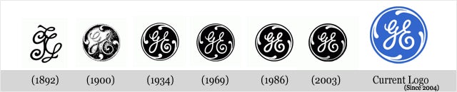
10. General Electric
—
General Electric launched in 1892, and since its 19th-century launch, the logo really hasn’t changed that much.
And why would it? The curly script and prongs circling the “GE” initials are simple, sleek and effective, which is what you want out of General Electric’s products. And while the design is purely ornamental (a product of the Art Nouveau style), it does kind of look like a washing machine in the spin cycle, which is one of the company’s most popular product lines.
Past Logos:
9. JPMorgan Chase
—
One of the largest financial institutions in the world, JPMorgan and Chase is the world’s most valuable bank with over 2.35 trillion dollars in assets. It’s also the sixth largest public company in the WORLD. So, needless to say, this is a company with authority.
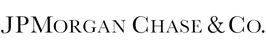
And they’ve done a great job of conveying that with their logos. The simple, bold print and minimal use of graphics definitely reads strong, authoritative and “if you’re late on a payment we’ll hit you with a late fee so fast it’ll make your head spin”. Which, as a bank, is pretty much what they’re going for.
8. Johnson & Johnson
—

You know the old saying “if it ain’t broke, don’t fix it?” Well, it might as well had been written for Johnson & Johnson, one of the world leaders in medical devices, pharmaceuticals and consumer packaged goods.
The logo was based on the signature of James Wood Johnson, one of the original founders of the company. And while they’re definitely not winning any points for creativity or originality (who doesn’t change their logo for 100 years?!), the fact that they’ve kept their logo consistent has created HUGE brand recognition within their market.
7. Facebook
—


Unless you’ve been living under a rock since 2005, Facebook doesn’t need an introduction. While the company, which was launched out of Mark Zuckerberg’s dorm room, was originally called “The Facebook”, the company quickly dropped “the” from the company name and went on to create the most successful social network of all time.
The Facebook logo works because it’s instantly recognizable. Even when the company redesigned the logo in 2015, they kept the key elements the same and just made minor stylistic changes to make sure they kept their brand intact.
6. ExxonMobil
—

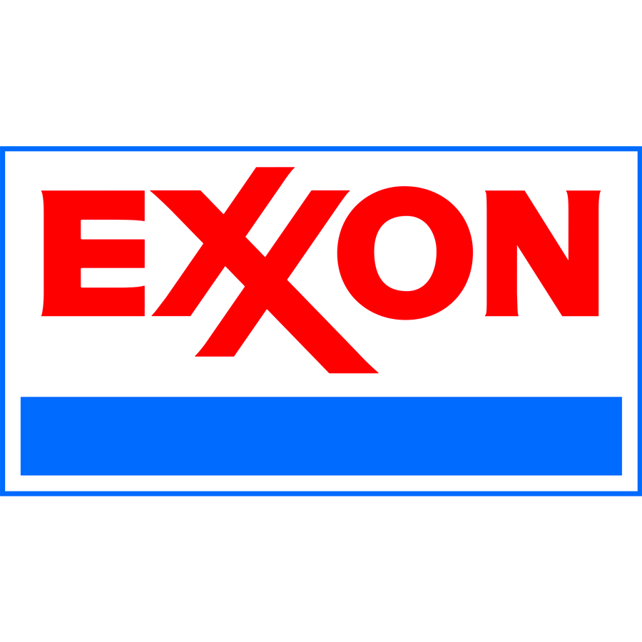

ExxonMobil is the biggest of the Big Oil companies in the world—not to mention one of the world’s most profitable companies. Exxon and Mobil used to be two separate companies, but joined forces (perhaps in an attempt at world domination?) in 1998.
For a company this powerful, their logo is kind of…. Meh. While the type is nice enough, the simplistic design doesn’t portray the kind of authority you’d expect from a company this major. To be honest, the logos that each company had before the merger were more unique and interesting than what they came up with together.
Moral of the story: less isn’t always more.
5. Amazon
—


I think I speak for just about everyone on the planet when I say “THANK YOU AMAZON!”. With Amazon Prime, I can have virtually anything under the sun delivered to my house in 48 hours or less. For FREE (ish). Jackpot.
And Amazon has done an amazing job of reflecting that in their logo. See that arrow that travels from the A to the Z? That’s a bit of subliminal trickery and suggests that just like the arrow moves from the A to the Z, Amazon will move their products from their warehouses straight to your door. It also looks like a happy face, which symbolizes their focus on customer happiness and satisfaction.
Genius, no?
4. Berkshire Hathaway
—


You might not have heard of Berkshire Hathaway, Inc., which is billionaire Warren Buffett’s conglomerate holding company, but that’s ok. Because you’ve DEFINITELY heard of their subsidiaries: GEICO, Fruit of the Loom, Dairy Queen, Brooks Running, Kraft Heinz… the list goes on.
And while Berkshire Hathaway Inc’s logo is incredibly simple, it actually works for them. As a conglomerate holding company, they don’t want the focus to be on them. They want it on their subsidiary companies. So their nondescript, simple logo design makes sense, while their subsidiaries are more “look at me, look at me” with their design-forward logos.
Their typeface also works in their favor; pairing the heavy weight with some more serious serifs makes them feel sturdy and steadfast, which is exactly what one would look for in a world-leading holding company. Well played, Berkshire Hathaway. Well played.
3. Microsoft
—
Past logos:


While Microsoft has had some missteps in recent years (I’m looking at you, Zune and Windows 10), the redesign of its long-time logo in 2012 was NOT one of them.
While the logo the company used from 1987 to 2012 was fine (I especially liked the mark in the “O” that made it look kind of like Pac-Man), it left a lot to be desired on the design side.
The new logo, with its use of color, feels a lot less harsh. And the use of cubed window to represent each of Microsoft’s major product offerings (blue for Windows, red for Office, green for Xbox and yellow for… well, yellow actually doesn’t stand for anything, but since a window can’t have three panes, we’ll let it slide) was genius.
It’s also worth noting that out of all the companies on this list, Microsoft seems to be the one with the biggest logo identity crisis. Seriously. Every time they design a new logo, it looks like it’s for a completely new company.
Not so smart on the brand identity front, Microsoft.
2. Alphabet
—
If you haven’t heard of Alphabet, don’t worry. The company is fairly new to the game, having just launched in 2015. But all you need to know is that Alphabet was formed by Larry Page and Sergey Brin and is the parent company of Google, not to mention over 200 other companies in the technology space.
So, yea… in the words of Ron Burgundy, they’re kind of a big deal.
But their logo? Not so much.
For a company that’s leading the charge on the technology front, their logo doesn’t feel so powerful. And as a parent company, Alphabet failed where Berkshire Hathaway succeeded. While Berkshire Hathaway stayed away from trying to emulate or recreate any of their subsidiaries’ logos, Alphabet clearly tried to recreate the Google magic (without directly ripping off their own Google logo). And unfortunately for them, the results kind of fell flat.
1. Apple
—


The top richest company in the world should come as no surprise. Apple Inc., which gave us the MacBook, the iPad, the iPhone, the iPod and quite a few other pieces of technology that people literally camp outside of stores to get their hands on, is arguably the most recognizable brand in the world.
And so is their logo. While the original logo that the company launched with in the mid-70’s was a little… strange (it had Issac Newton sitting next to a tree. Seriously.), they switched to their iconic apple imagery in 1976.
And while the company has made minor changes in terms of color and finish, the logo has remained intact for the last 30 plus years. What works about the Apple, Inc. logo is that when you see it, you immediately think Apple products. There’s no confusion about what you’re getting or what they’re dishing out. And that, my friends, is just one of the many reasons why Apple is the richest company on the globe.
What can you learn from these logos?
—
So what can you, as an entrepreneur (who I’m sure is successful, but probably isn’t creeping up to make an appearance on this list anytime soon) learn from these logos?
Think about what your logo says about your brand
You want your logo to reflect who you are as a brand. So, just like the JPMorgan Chase logo screams authority, you want your logo to scream whatever it is you stand for as a brand.
Don’t be afraid to make an impact
While you don’t want to design a logo that’s too over the top, don’t be afraid to make a statement. You don’t want to end up like ExxonMobil: a great and powerful company with a logo that falls flat.
Find what works for you—and stick with it
Many of the companies on this list—including Apple, Johnson & Johnson, and General Electric —have had the same logo concept with only minor variations since pretty much the beginning (and in the case of J&J, that’s more than 100 years). And even when they’ve made some more significant changes, they’ve been in line with the same theme.
While it never hurts to reinvent yourself, try to find what works for you from the get-go – and then stick with it. People get attached to your logo and come to associate it with your brand, and if you can keep that logo consistent, you’ll increase your brand recognition as time goes on.
No comments:
Post a Comment